I decided to do a composition Visualization Series. Here is the first one called "Rule of Thirds"

In Visualization, image composition is how different visual elements(components, furnitures, objects, walls, plants etc.) are arranged inside of the camera image aspect ratio.
The purpose of composition in visualization is to create a visually compelling image that evokes the interest of the viewer.
In my experience, I have seen both successful and unsuccessful visualizers. If you study the composition of Alex Roman, Jacinto Monmteiro even with our own SV Artists; Gerbe Dumahil and David Brufau, their attention to composition is very obvious. Their camera set-up, together with the use of design elements is, I should say, one of their priorities. They are successful in placing their emphasis and using the elements to support it.
 |
| Alex Roman Camera Set up |
 |
| Jacinto Monterro Set up |
|
 |
| David Brufau aka. dBRenders |
 |
| Gerbe Dumahil Camera composition |
In this series, I would like to look at composition and the design elements. I will attempt to explain this subject using SketchUp and VFSU and my knowledge as visual arts teacher.
Well! Without further adieu, let me start with this compositional tool "the Rule of Thirds".
The Rule of thirds is one of the most well-known rule in image composition. It is very easy to learn and adapt in visualization and in setting-up the camera and its image aspect ratio.
Often people place their main subject into the middle of the frame, or sometimes visualizer just care to put all the things they have model inside the picture plane and they manipulate the field of view (FOV) of their camera in order to put everything inside the picture plane.
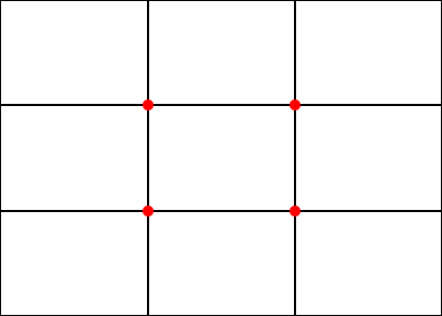
I am introducing this Rule of third not as a mantra, but to introduce that it is useful in composition, knowing there are always exceptions to the rules. Rule of thirds suggests to place the subject off the center. According to rule of thirds the picture frame is mentally divided in to three parts horizontally and vertically as in the below image.
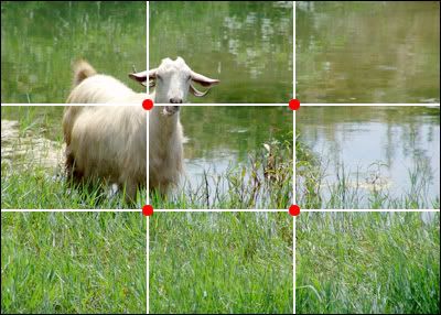
The main subject , say in the photograph below, is then placed in one of the four locations where the lines intersect. These intersections are marked with red dots.
I think the concept is so clear, so now how can we apply this in SketchUp? How can we apply the "rule of thirds". In order to simplify this, I decided to provide you with a little tool and we will use the style functionality of SketchUp to load this simple tool that I created in Photoshop.
First I want you to download this simple tool.
Now let us use Style to load this. Save it in your chosen folder.
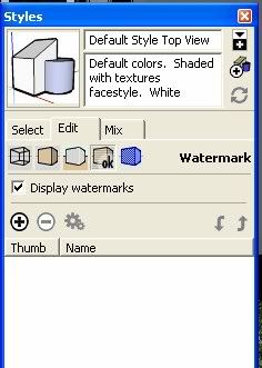
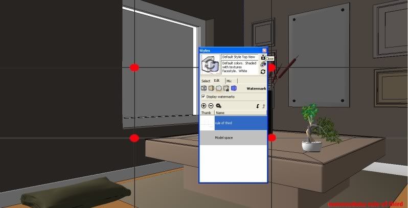
Step 1: Open the Style Window and click watermark.
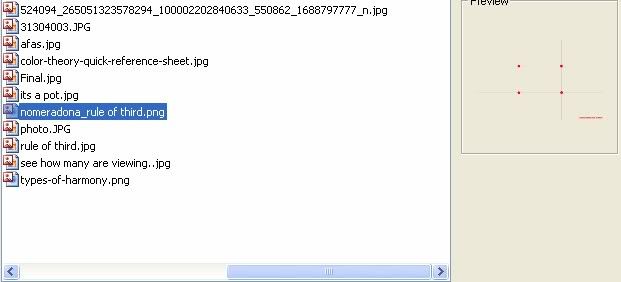
Step 2: Access the "Nomeradona rule of third"
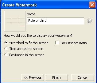
Now browse the location of Nomeradona rule of third that you saved in your folder
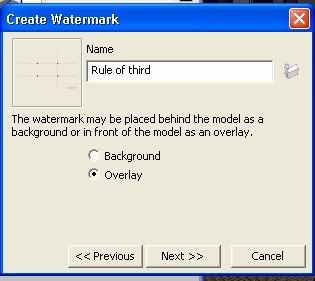
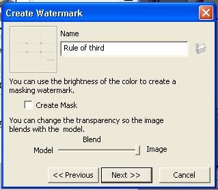
Step 3: See the settings on Images below
Step 4: Save as style. You can save it as style or save animation scene, but be sure to include the style.
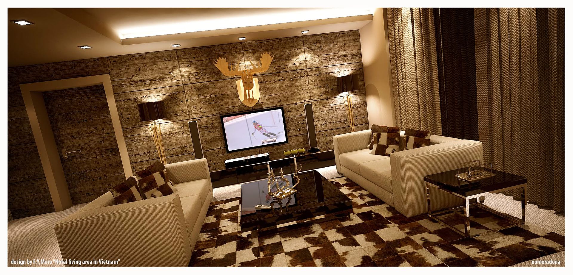
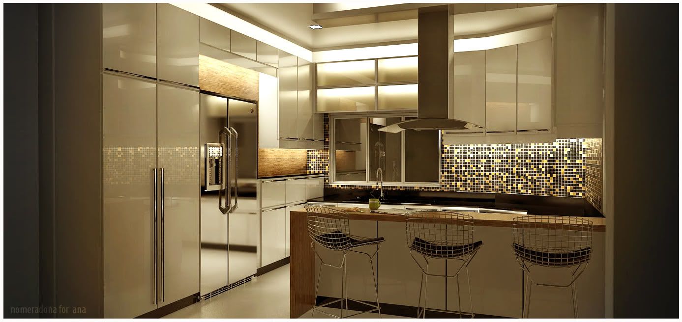
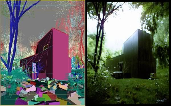
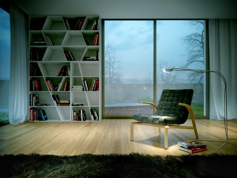
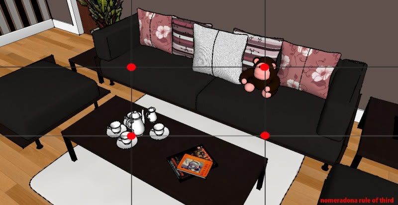
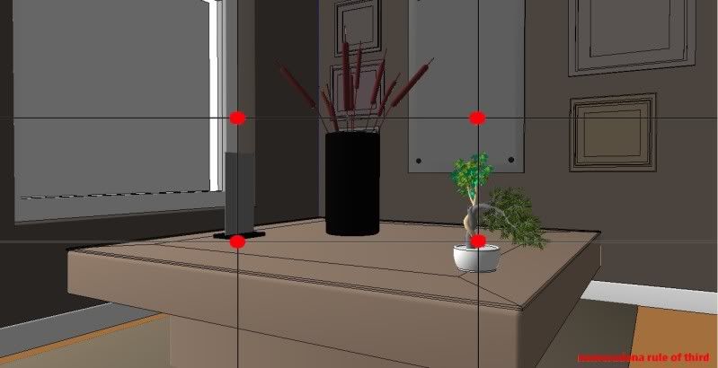
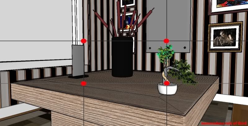
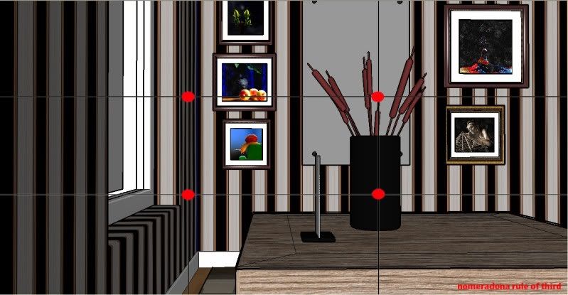
Now you can use this as composition tool. Some images below showing attempts on how to use it.
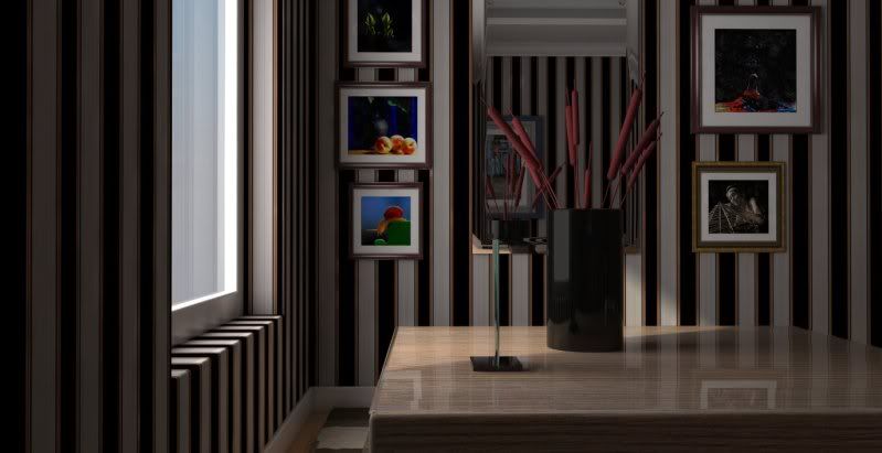
Raw render using the last composition.